Redesign of UX, UI and branding along with Design System Libraries
Digital Rebrand & Design System
At McCarthy & Stone, the challenge was to translate their print-based brand guidelines into engaging and accessible digital experiences across web platforms. The goal was to maintain the essence of the brand identity while ensuring usability across diverse screen sizes. Additionally, there was a pressing need to build a scalable design system to drive consistency and efficiency in UI/UX design.
What we needed to do
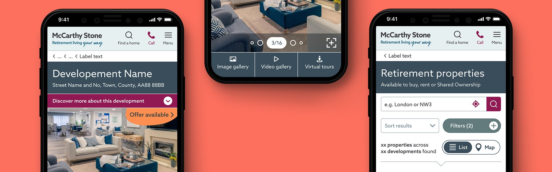
Design key pages and features to create a seamless experience across devices
Create a comprehensive design system, including foundational principles, component and icon libraries
Mobile-first approach prioritising accessibility to meet user needs and align with modern design best practices
What was achieved
Transforming brand guidelines into meaningful digital experiences
Successfully delivered polished user-friendly designs for key pages and features
Delivered Design System libraries including foundation, icon and component libraries
“Transforming print guidelines into seamless digital experiences”
Data driven designs
Working closely with cross-functional teams including developers, stakeholders and user researchers, we leveraged our research findings to align designs with real-world needs.
Key touch points
• Address research findings in key pages and functions
• Mobile first approach (first time for McCarthy & Stone)
• Audit and alignment of patterns across devise types

Adapting brand guidelines
I meticulously translated print-based guidelines into intuitive digital interfaces, ensuring the brand’s integrity was preserved while optimising for web functionality.
Key touch points
• Adapting and growing print guidelines to reflect digital
• Stakeholder management based on a digital first approach
• Accessibility with focus on AA
Building the Design System Libraries
Leading the creation of the design system by defining foundational principles and building libraries for components and icons. This framework served as the backbone for scalable and consistent UI/UX across the platform.
Key touch points
• Basic foundation library
• Icon library
• Component library

Accessibility and mobile-first approach
With mobile usage at the forefront, we designed responsive layouts that prioritised functionality and engagement, ensuring an optimised experience on all screen sizes.
Key touch points
• Standardised components and patterns
• Accessibility and scalability with a focus mobile designs
• Stakeholder management ensuring business buy in

What was achieved
Seamless Digital Transformation
The new design built on McCarthy & Stone’s existing CMS, successfully translated their brand guidelines into polished, user-friendly digital experiences. Working closely with business and cross functional teams we where able to supply hi fidelity designs incorporating research findings with the new brand look and feel with great success.
Scalable Design System
The comprehensive design system libraries enabled efficient collaboration across teams, ensuring consistency and faster implementation of new features.
Improved Accessibility and Responsiveness
The accessibility-first, mobile-friendly designs made the platform more inclusive and engaging, accommodating their diverse user base. Working closely with front end developers we were able to standardise, align and simplify existing components increasing the site speed significantly.
Enhanced User Satisfaction
Feedback from usability tests and user engagement metrics reflected a positive reception, highlighting the functionality and delight delivered by the new brand.